A wedding venue sells a memory, not a ballroom
Couples don't book square metres and a capacity chart — they book the day they can already picture. A wedding venue website's whole job is to make them see it.
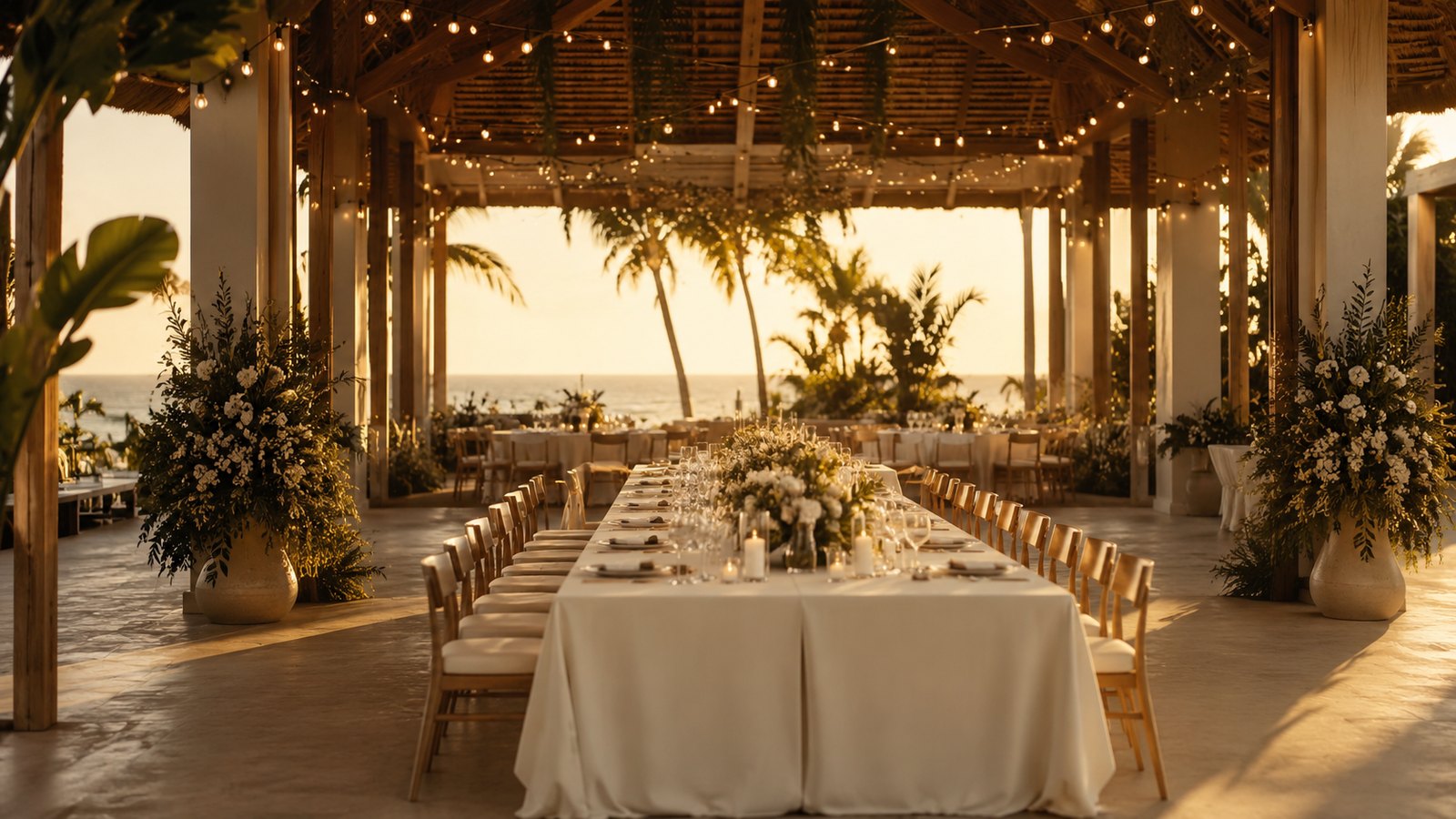
A couple choosing where to marry isn't comparing capacities. They're trying to feel a single evening — the light at 5pm, the walk down the aisle, the first dance under something. The venue that lets them feel it first is the one that gets the deposit.
What should a wedding venue website actually show?
Show the day, in order. First light on the lawn, the ceremony setup, the room as it turns from dinner to dancing. A wedding is a sequence, so the page should move like one — not sit as a static gallery and a PDF of packages.
Most venue sites do the opposite. They lead with a capacity table, a grid of rooms, and an enquiry form, and quietly ask the couple to assemble the most important day of their life out of bullet points. Few can.

Why capacity charts lose bookings
A number tells a planner the room fits 180. It tells a bride nothing about how the night feels. Facts qualify a venue; feeling books it. Lead with the feeling, and let the logistics live one tap deeper for the couple who's already sold.
A wedding venue isn't a room for hire. It's a memory you're asking someone to buy in advance.
The mechanics of this are the same ones behind a good luxury landing page: a first frame that's a place, a slow middle that builds the day, and a quiet, single call to book a viewing right where the longing peaks.
Sell the evening they'll remember. The ballroom is just where it happens.