Quiet luxury and the end of cold minimalism
The all-white, ice-cold gallery look has aged out. Warm, muted, lived-in palettes now signal the kind of luxury that doesn't need to shout.
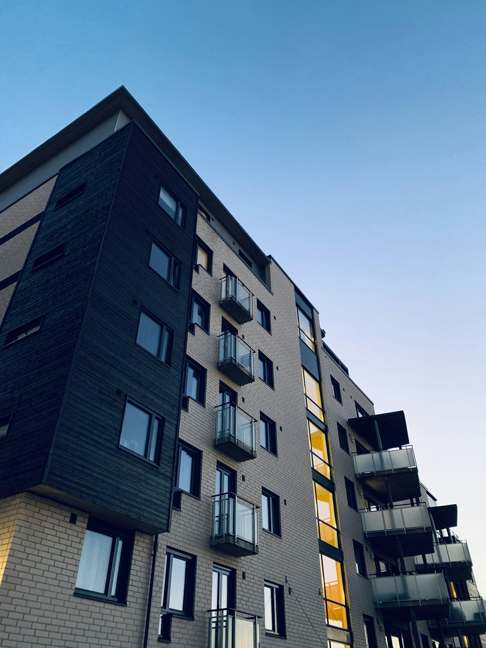
For a decade, "premium" meant cold. Stark white space, hard edges, grey type on grey, a showroom scrubbed of any sign of life. It read as expensive because it read as untouchable. That era is closing.
Quiet luxury speaks in warmth
What's replacing it is what the property world now calls quiet luxury — warm, muted palettes over sterile minimalism. Clay, oat, soft umber, the deep green of a shaded courtyard. Tones that feel inhabited rather than staged. The shift isn't decorative; it's a different message. Cold minimalism says look but don't touch. Warm restraint says you could live here, comfortably, for years.
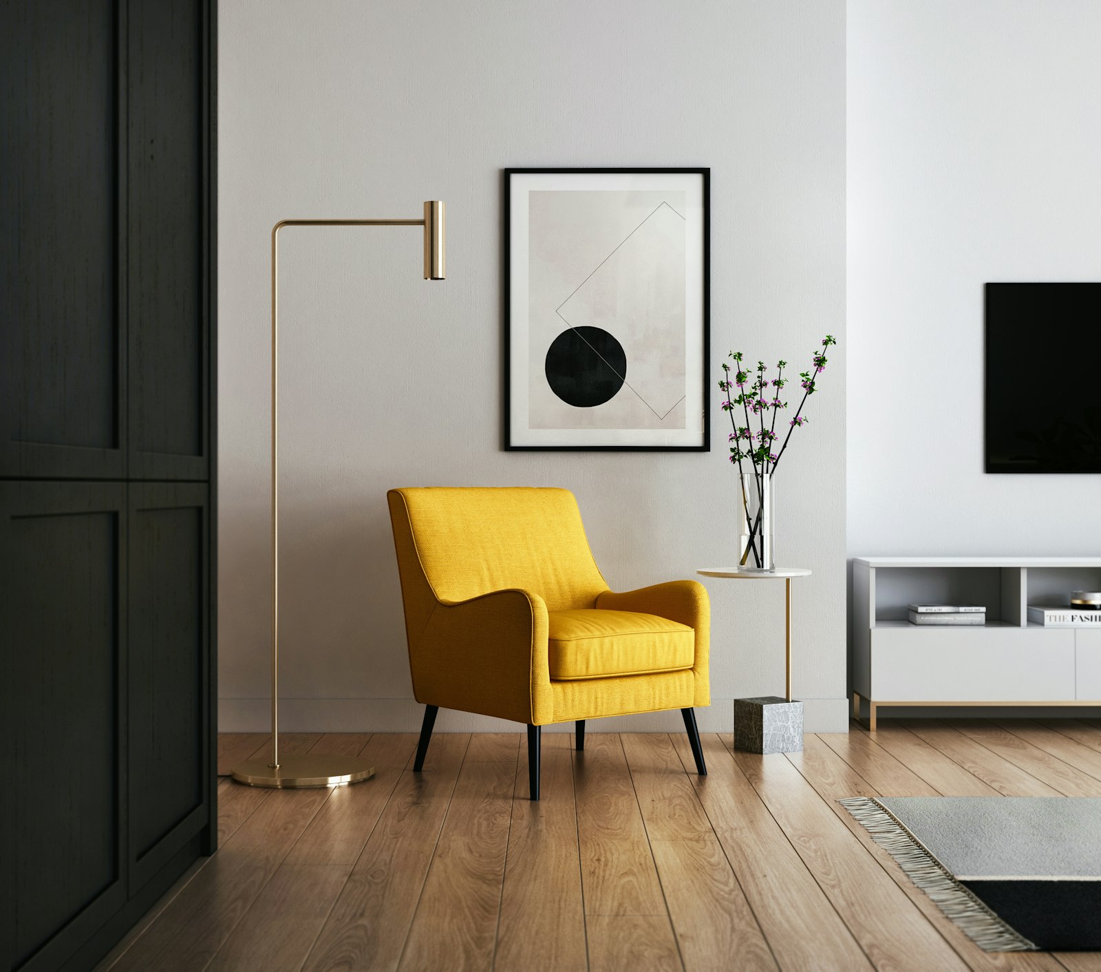
For a residence, that difference is the whole sale. A buyer choosing a home wants to imagine belonging, not visiting a museum.
Quiet is harder than loud
Restraint is deceptively difficult. A warm palette done badly just looks beige and tired. Done well, it carries enormous confidence — the same confidence as a perfectly tailored coat in a single muted color. Every tone is deliberate, nothing competes, and the result feels effortless precisely because it wasn't.
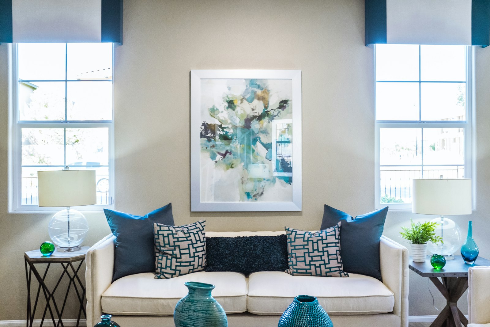
The loudest thing a luxury brand can do now is lower its voice.
So when the next property site reaches for the safe white grid, ask what it's really saying. Cold has stopped reading as expensive. Warmth — handled with restraint — is the new signal that something here is worth keeping.