Premium is the sum of small decisions
There's no single flourish that makes a site feel expensive. It's a hundred tiny choices nobody notices individually — and everyone feels together.
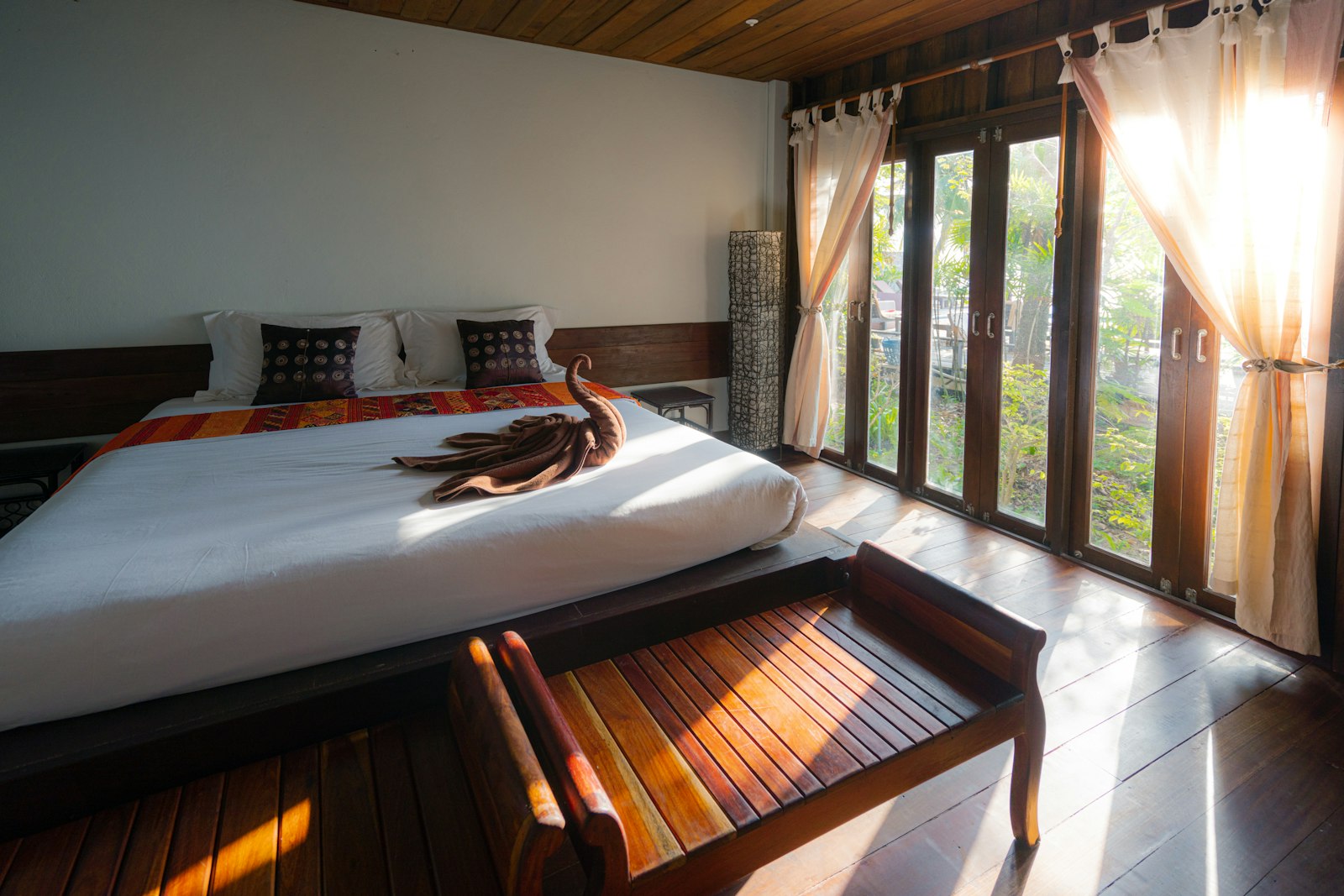
Clients sometimes ask for "the wow moment" — the one big animation or 3D scene that will make the site feel high-end. We understand the impulse, but it's the wrong unit of measurement. Premium isn't a moment. It's an accumulation.
No single thing does it
Pick any genuinely expensive-feeling site apart and you won't find one decisive flourish. You'll find a thousand small ones agreeing with each other: the easing curve that decelerates like a heavy door rather than snapping shut, the line-height that lets text breathe, the consistent 8-pixel rhythm holding everything in quiet alignment, the hover that responds in 200 milliseconds instead of 400.
Individually, none of these register. A visitor never thinks what a tasteful transition. They think this feels considered — and that feeling is the sum.
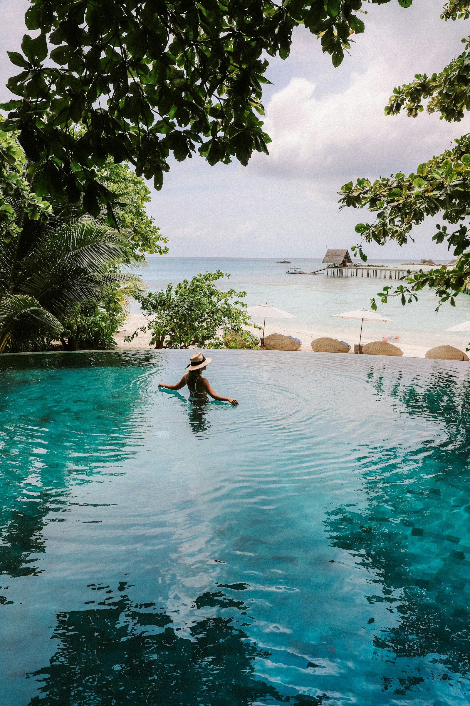
Cheapness is also accumulated
The reverse is true and crueller. One slightly-off shadow won't sink a page. But a stiff transition, plus mismatched spacing, plus a button that's a touch too small, plus type set a hair too tight — and the page reads as cheap even when the photography is gorgeous. Cheap is what consistency-debt looks like.
Nobody can name the detail that makes a site feel expensive, because it was never one detail.
This is why we don't chase the wow moment. We chase the average. A resort site earns its premium not from a hero reel but from the same care extended to the smallest interaction.
Luxury, on the web as anywhere, isn't loud. It's the suspicion that someone sweated over a choice you'll never consciously see. Multiply that suspicion across a whole experience, and you have premium.