A landing page should open like a film, not a brochure
You're already paying for the traffic. The page it lands on decides whether the click becomes an enquiry — or a bounce you never see.
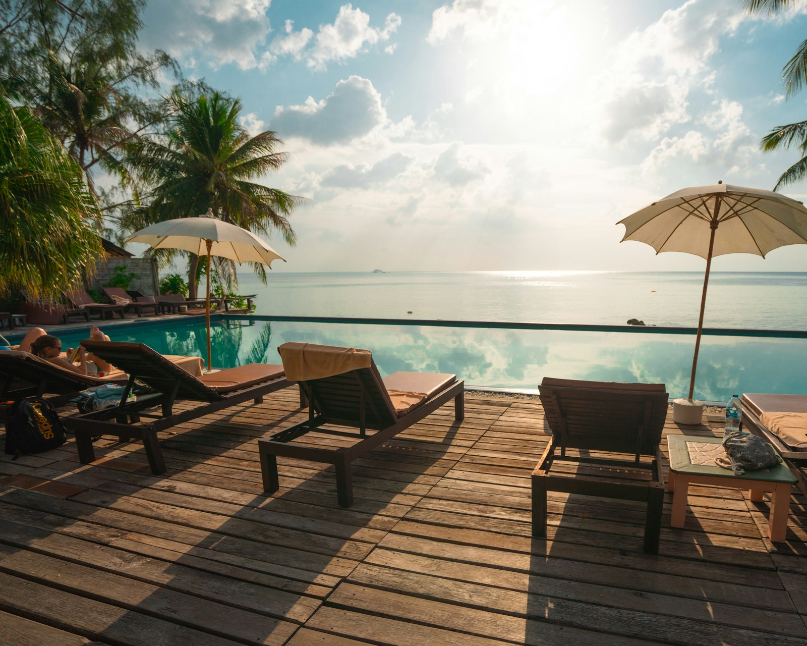
You buy the click from an ad, a reel, a search result. It costs real money. Then it lands on a page that opens with a logo, a menu, and three columns of links — and the spell you paid for breaks in the first second.
The first frame is the whole pitch
Travel decisions are made on feeling first and facts second. People decide whether a place is for them long before they read a rate. So the opening frame of a landing page is doing the most important work on the site, and a wall of navigation is the wrong thing to put there.
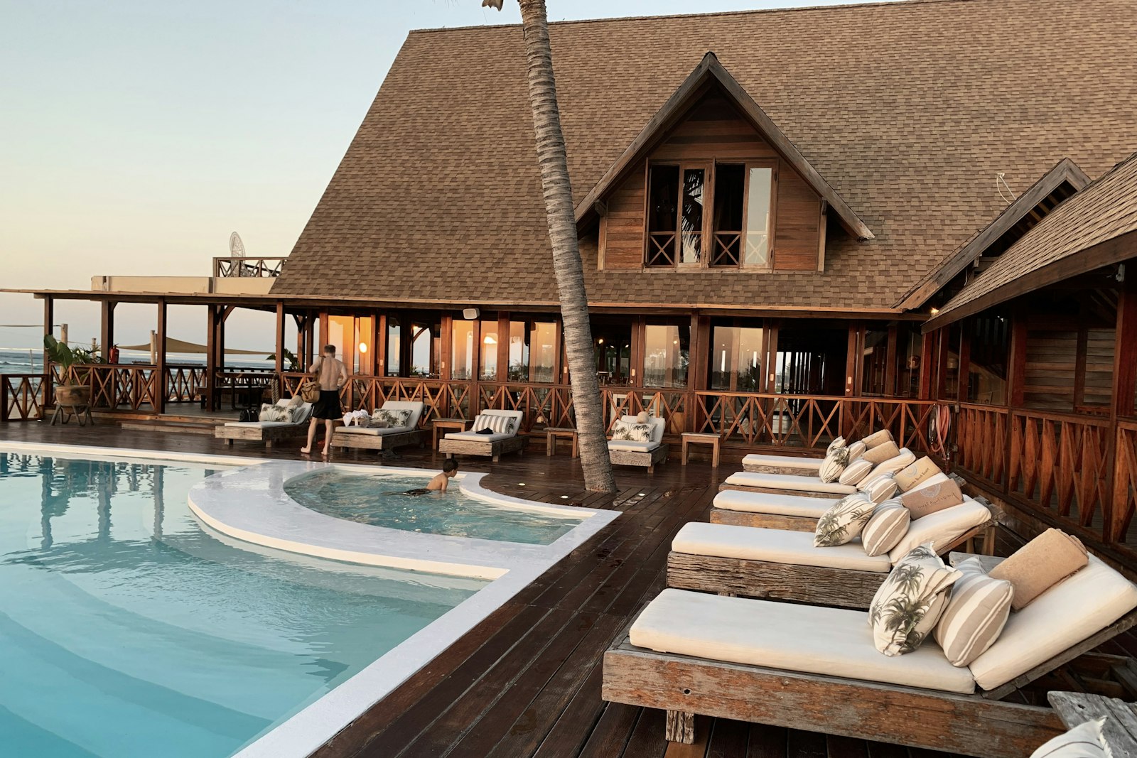
A page that opens like a film does the opposite. Golden hour, one villa, one held moment — the place introduces itself before a single word is read. The visitor isn't deciding whether to keep scrolling. They already are.
Then the pace earns the enquiry
After the cold open, the page slows down. Scroll becomes the controller; each stay, each package gets its own scene to live in rather than a row in a dropdown. Visual storytelling does the convincing, and the next step — book, order, enquire — sits exactly where the attention lands.
A brochure asks to be read. A film asks to be watched. Only one of them holds people to the end.
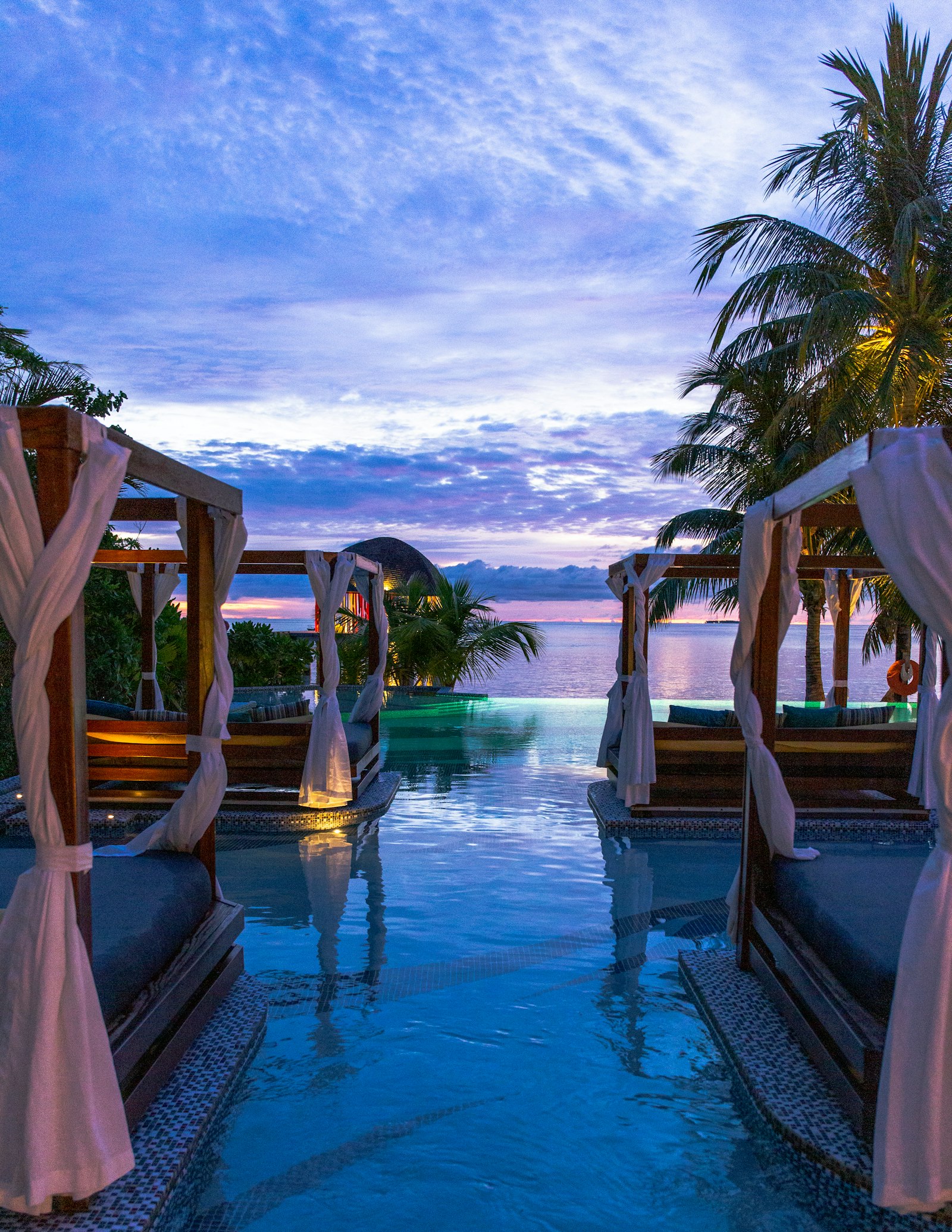
Built mobile-first, it loads fast enough that the paid click never has time to cool. The traffic you were already buying finally arrives somewhere worth the spend.
The page isn't decoration around a booking button. It's the part of the sale that used to happen in person — now it just happens before anyone picks up the phone.