A menu is a story, not a spreadsheet
Most online menus are a price grid in disguise — left column dishes, right column numbers. The kitchen spent months on the food. The page gives it a row.
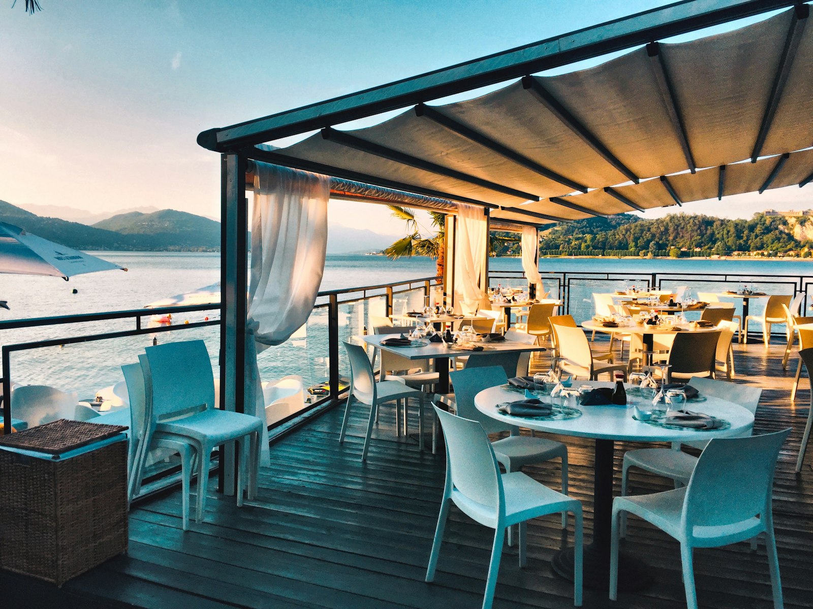
Open most restaurant websites and find the menu, and you'll find a spreadsheet wearing a serif font. Dish on the left, price on the right, repeat for forty rows. It's the layout of an invoice. And it's asking diners to feel hungry while reading something that looks like it was exported from accounting.
The grid kills the appetite
A price grid answers exactly one question — how much — and answers nothing else. It doesn't say where the fish came from this morning, why the chef builds the menu in that order, what the room smells like when the dish arrives. The information is there. The desire isn't.
This matters more than it used to. Roughly 58% of diners say they'll choose the more aesthetic, "share-worthy" venue over a plainer one. The menu is part of that aesthetic — and a spreadsheet is the opposite of share-worthy.
Sequence is the secret
A menu has an order the kitchen intends, the same way an album has a track listing. Present it as a sequence and you give people the meal before they sit down: the cold open, the dish the room is built around, the close.
Diners don't fall in love with a list. They fall in love with the order things arrive in.
This is editorial work — pacing, restraint, one idea per moment. Let the hero dish breathe. Let the prices recede instead of marching down the right margin.
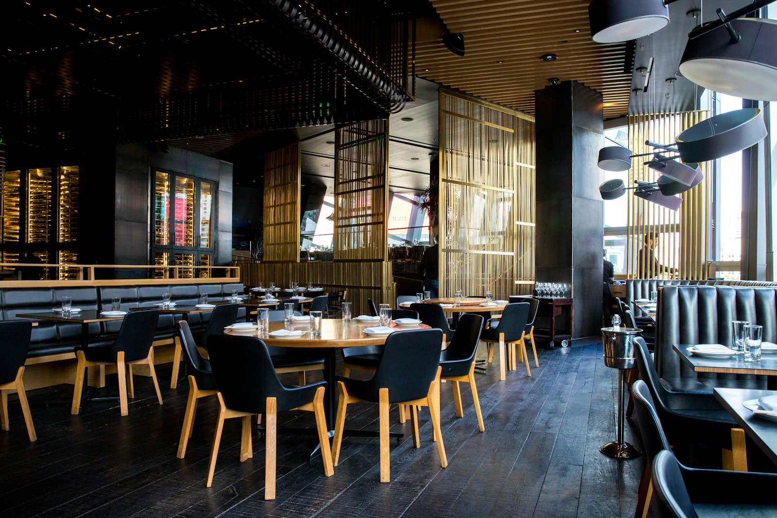
The food deserves more than a row in a table. Give the menu the same care the kitchen gives the plate, and people will read it the way they eat — slowly, and wanting more.